
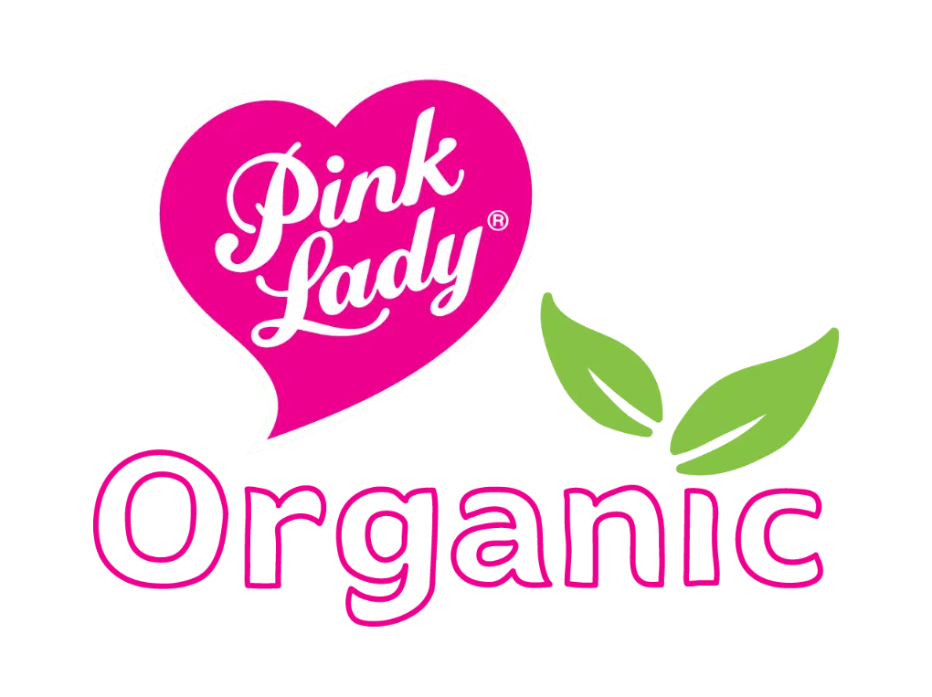
New Pink Lady® Organic sub branding stands out in high growth category
Once a niche market filled by only a few passionate growers, demand for organic fresh produce is at an all-time high, bolstered by renewed consumer interest in health and wellness and growing eco-consciousness.
According to a 2021 study by Accenture[1], over 60% of consumers plan to make more sustainable or ethical purchases and higher income consumers have already demonstrated a willingness to pay a premium for organically grown apples.
To realise the full potential of this high growth category, and in recognition of the investment already made by organic growers in the Pink Lady® network, the Global Brand team has developed a Pink Lady® Organic sub-brand, with supporting guidelines and assets including label and packaging templates. APAL will in turn invest more behind specific organic initiatives each year to support those committed to the additional effort and passion of growing organically.
“This is the first time Pink Lady® branded organically grown apples have had their own distinct design treatment within the Pink Lady® visual identity,” says APAL’s Head of Commercial Development, Craig Chester. “We know this is an important extension to ensure more high quality organic product can be sold within the Pink Lady® brand”
Much like child-friendly PinKids® – the sub brand developed for smaller sized Pink Lady® apples – it was important that Pink Lady® Organic be immediately recognisable to consumers as being Pink Lady®, but also quickly and easily differentiated from the conventionally grown branded apples.
Meeting the Design Challenge
The branding challenge was considerable, with the new sub brand identity needing to be suitable for application across PLU labels, packaging (consumer and export), and across brand and trade promotional materials.
Further adding to the design challenge, organic Pink Lady® apples are often packaged in co-branded, retailer packs, presenting a busy and varied design background on which to add the new visual identity.
“Our brief to the Agency was that the sub brand should stand out, but at the same time, have variations that ensure we can avoid clashes with the rest of the packaging design,” explains Craig.
The result retains the Pink Lady® signature ‘pink’, adding a pop of fresh green to the brand mark: “We love our instantly recognisable pink, but we know green is the automatic cue for organic products, signalling growth, freshness, safety and environment associations to consumers,” explains Craig.
APAL also opted to remove excessive colour from export cartons: “The reduction in ink required to print these cartons is not only an environmentally responsible move and consistent with our core values but exposes the natural kraft board which further reinforces positive eco-conscious brand cues,” says Craig.

Ready for use on all packaging
Licensees are now required to use the new Pink Lady® Organic sub branding across all formats of packaging and labels. The new, Pink Lady® Organic guidelines can be found in the Brand Hub here**
If you need assistance applying the approved Pink Lady® Organic designs to your packaging dimensions, or for any other brand related enquiries, please contact Head of Commercial Development, Craig Chester.


